如何实现两栏布局,右侧自适应?三栏布局中间自适应呢?
当前位置:点晴教程→知识管理交流
→『 技术文档交流 』
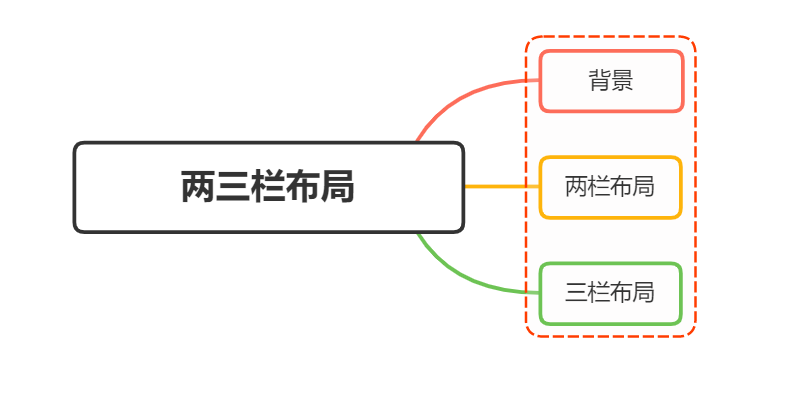
一、背景在日常布局中,无论是两栏布局还是三栏布局,使用的频率都非常高 两栏布局两栏布局实现效果就是将页面分割成左右宽度不等的两列,宽度较小的列设置为固定宽度,剩余宽度由另一列撑满, 比如
这种布局适用于内容上具有明显主次关系的网页 三栏布局三栏布局按照左中右的顺序进行排列,通常中间列最宽,左右两列次之 大家最常见的就是
二、两栏布局两栏布局非常常见,往往是以一个定宽栏和一个自适应的栏并排展示存在 实现思路也非常的简单:
代码如下: <style>
.box{
overflow: hidden; 添加BFC
}
.left {
float: left;
width: 200px;
background-color: gray;
height: 400px;
}
.right {
margin-left: 210px;
background-color: lightgray;
height: 200px;
}
</style>
<div class="box">
<div class="left">左边</div>
<div class="right">右边</div>
</div>还有一种更为简单的使用则是采取:flex弹性布局 flex弹性布局<style>
.box{
display: flex;
}
.left {
width: 100px;
}
.right {
flex: 1;
}
</style>
<div class="box">
<div class="left">左边</div>
<div class="right">右边</div>
</div>
注意的是, 这个属性导致了列等高的效果。 为了让两个盒子高度自动,需要设置: 三、三栏布局实现三栏布局中间自适应的布局方式有:
两边使用 float,中间使用 margin需要将中间的内容放在 实现代码如下: <style>
.wrap {
background: #eee;
overflow: hidden; <!-- 生成BFC,计算高度时考虑浮动的元素 -->
padding: 20px;
height: 200px;
}
.left {
width: 200px;
height: 200px;
float: left;
background: coral;
}
.right {
width: 120px;
height: 200px;
float: right;
background: lightblue;
}
.middle {
margin-left: 220px;
height: 200px;
background: lightpink;
margin-right: 140px;
}
</style>
<div class="wrap">
<div class="left">左侧</div>
<div class="right">右侧</div>
<div class="middle">中间</div>
</div>原理如下:
这种实现方式存在缺陷:
两边使用 absolute,中间使用 margin基于绝对定位的三栏布局:注意绝对定位的元素脱离文档流,相对于最近的已经定位的祖先元素进行定位。无需考虑HTML中结构的顺序 <style>
.container {
position: relative;
}
.left,
.right,
.main {
height: 200px;
line-height: 200px;
text-align: center;
}
.left {
position: absolute;
top: 0;
left: 0;
width: 100px;
background: green;
}
.right {
position: absolute;
top: 0;
right: 0;
width: 100px;
background: green;
}
.main {
margin: 0 110px;
background: black;
color: white;
}
</style>
<div class="container">
<div class="left">左边固定宽度</div>
<div class="right">右边固定宽度</div>
<div class="main">中间自适应</div>
</div>实现流程:
两边使用 float 和负 margin<style>
.left,
.right,
.main {
height: 200px;
line-height: 200px;
text-align: center;
}
.main-wrapper {
float: left;
width: 100%;
}
.main {
margin: 0 110px;
background: black;
color: white;
}
.left,
.right {
float: left;
width: 100px;
margin-left: -100%;
background: green;
}
.right {
margin-left: -100px; /* 同自身宽度 */
}
</style>
<div class="main-wrapper">
<div class="main">中间自适应</div>
</div>
<div class="left">左边固定宽度</div>
<div class="right">右边固定宽度</div>实现过程:
缺点:
使用 display: table 实现
<style>
  .container {
    height: 200px;
    line-height: 200px;
    text-align: center;
    display: table;
    table-layout: fixed;
    width: 100%;
  }
  .left,
  .right,
  .main {
    display: table-cell;
  }
  .left,
  .right {
    width: 100px;
    background: green;
  }
  .main {
    background: black;
    color: white;
    width: 100%;
  }
</style>
<div class="container">
  <div class="left">左边固定宽度</div>
  <div class="main">中间自适应</div>
  <div class="right">右边固定宽度</div>
</div>
实现原理:
使用flex实现利用 代码如下: <style type="text/css">
.wrap {
display: flex;
justify-content: space-between;
}
.left,
.right,
.middle {
height: 100px;
}
.left {
width: 200px;
background: coral;
}
.right {
width: 120px;
background: lightblue;
}
.middle {
background: #555;
width: 100%;
margin: 0 20px;
}
</style>
<div class="wrap">
<div class="left">左侧</div>
<div class="middle">中间</div>
<div class="right">右侧</div>
</div>实现过程:
优点:
grid网格布局代码如下: <style>
.wrap {
display: grid;
width: 100%;
grid-template-columns: 300px auto 300px;
}
.left,
.right,
.middle {
height: 100px;
}
.left {
background: coral;
}
.right {
background: lightblue;
}
.middle {
background: #555;
}
</style>
<div class="wrap">
<div class="left">左侧</div>
<div class="middle">中间</div>
<div class="right">右侧</div>
</div>跟 转自https://www.cnblogs.com/smileZAZ/p/18226250
该文章在 2025/10/14 15:22:07 编辑过 |
关键字查询
相关文章
正在查询... 


|


 400 186 1886


